BetterBacks is an established chiropractic clinic in Mitcham, in Melbourne's east, with loyal patients and glowing Google reviews. This is a proactive, end-to-end redesign of its website, from content audit and redesign principles through information architecture, UX, visual and content design, to a working site with integrated booking and a content management system (CMS), hosted and ready to launch.
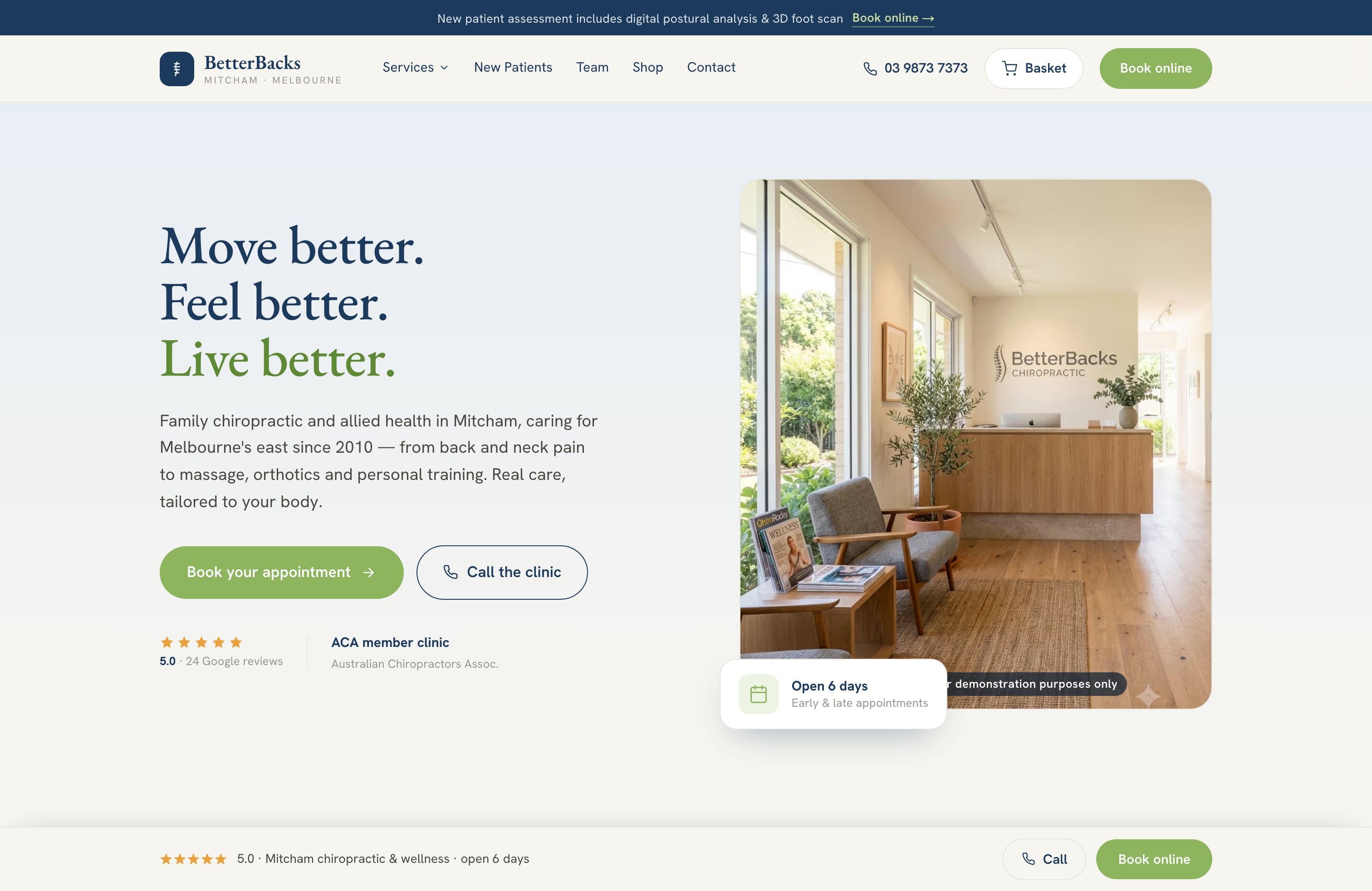
The opportunity
For a new patient, a clinic's website is the front desk. It's where they decide whether you can help, whether they trust you, and whether to book. BetterBacks already had the hard part, a reputation patients rave about. The website had room to carry more of that work.
Booking that works on any phone
Most people look for a clinic on their phone, often when they're in pain. Right now, booking hands them over to an external system that wasn't built for mobile. Bringing booking into the site, and making it easy on a small screen, was the single biggest opportunity.
Making the good stuff easy to find
The site holds a lot of useful information about treatments and the team, but much of it sits in long blocks of text, and the best reviews sit low on the page. Breaking it up and bringing reviews forward helps people quickly see why patients choose BetterBacks.
A clear path from "my back hurts" to booked
People don't arrive knowing they need dry needling or orthotics; they arrive knowing what hurts. A way in by symptom, and a clear next step on every page, means fewer people leave without finding what they came for.
The approach
This wasn't a rebuild for the sake of it. The aim was to make the website reflect how good the clinic already is, and make it simpler to use for every patient. Structure came before styling.
01Audit and review
I audited every page of the site: its content, structure, user journeys, design and booking flow, and reviewed it against UX best practice and a set of competitor clinic websites.
02Strategy
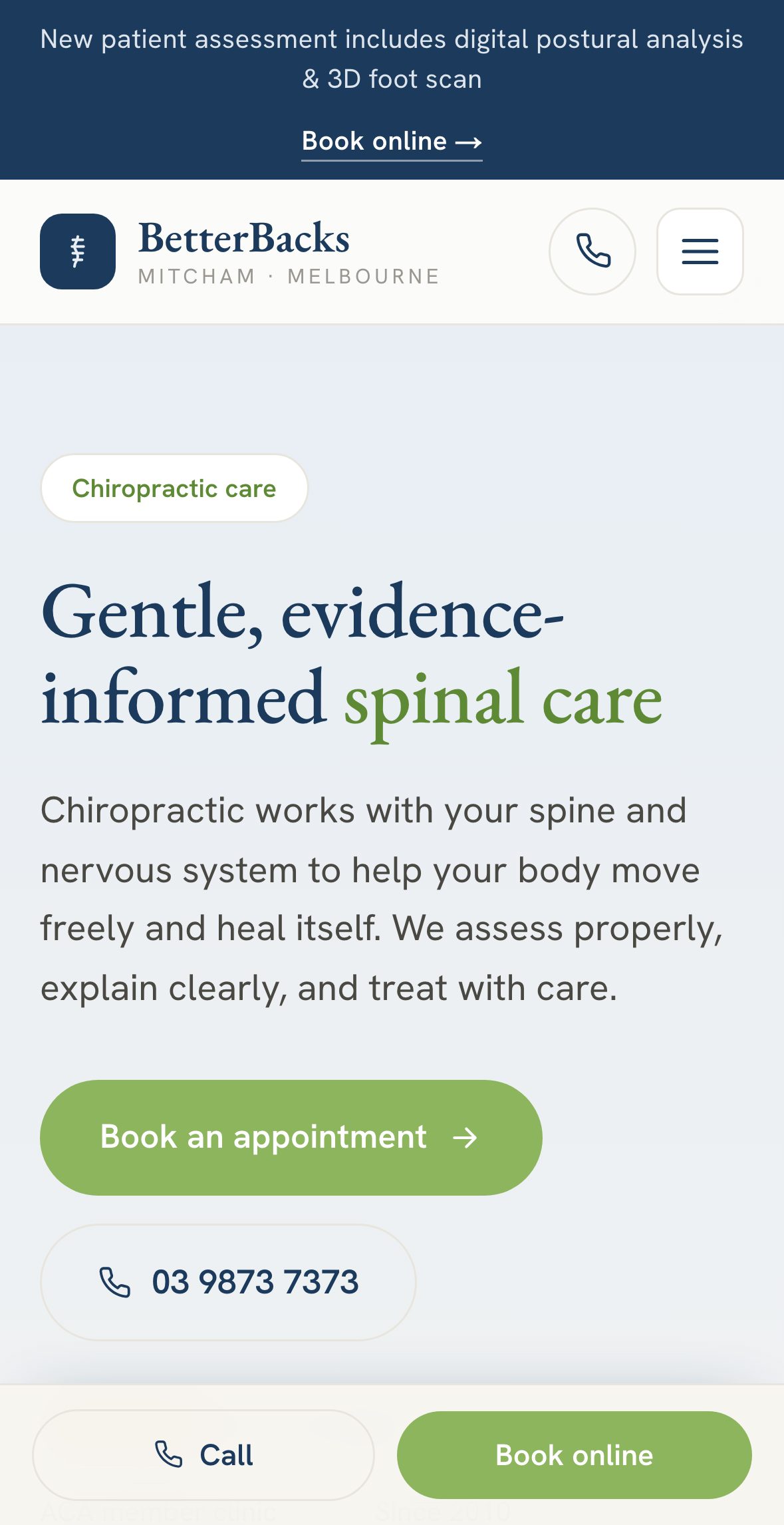
The findings became a short set of redesign principles, then user journeys for new and returning patients and a new information architecture (the site map and navigation).
03Design
UX and interface design, a brand evolution, and content design: copy rewritten so every page is quick to scan and ends in a clear next step.
04Build and hosting
A fast, responsive site built in Next.js with integrated booking, a Sanity CMS so the clinic can update content itself, and hosting on Netlify.
It started with an audit
Auditing the site page by page showed a business with plenty to offer and a few things getting in its way: journeys that stopped without a next step, long copy with no call to action, important pages that were hard to reach from the menu, and booking that sent patients off-site. Comparing it with other clinic sites and UX best practice set one clear objective: help patients find the right care, and book it, on the site.
Four principles for the redesign
Every decision after the audit was tested against these.
01Start with what hurts
Let patients begin from their symptom, not a treatment name they may not know.
02No dead ends
Every page answers a question and ends with a next step.
03Simple before clever
Built for everyone who walks through the door. Plain labels, familiar patterns, nothing to figure out.
04Booking always within reach
One tap from anywhere, on any device, without leaving the site.
An experience that starts with what hurts
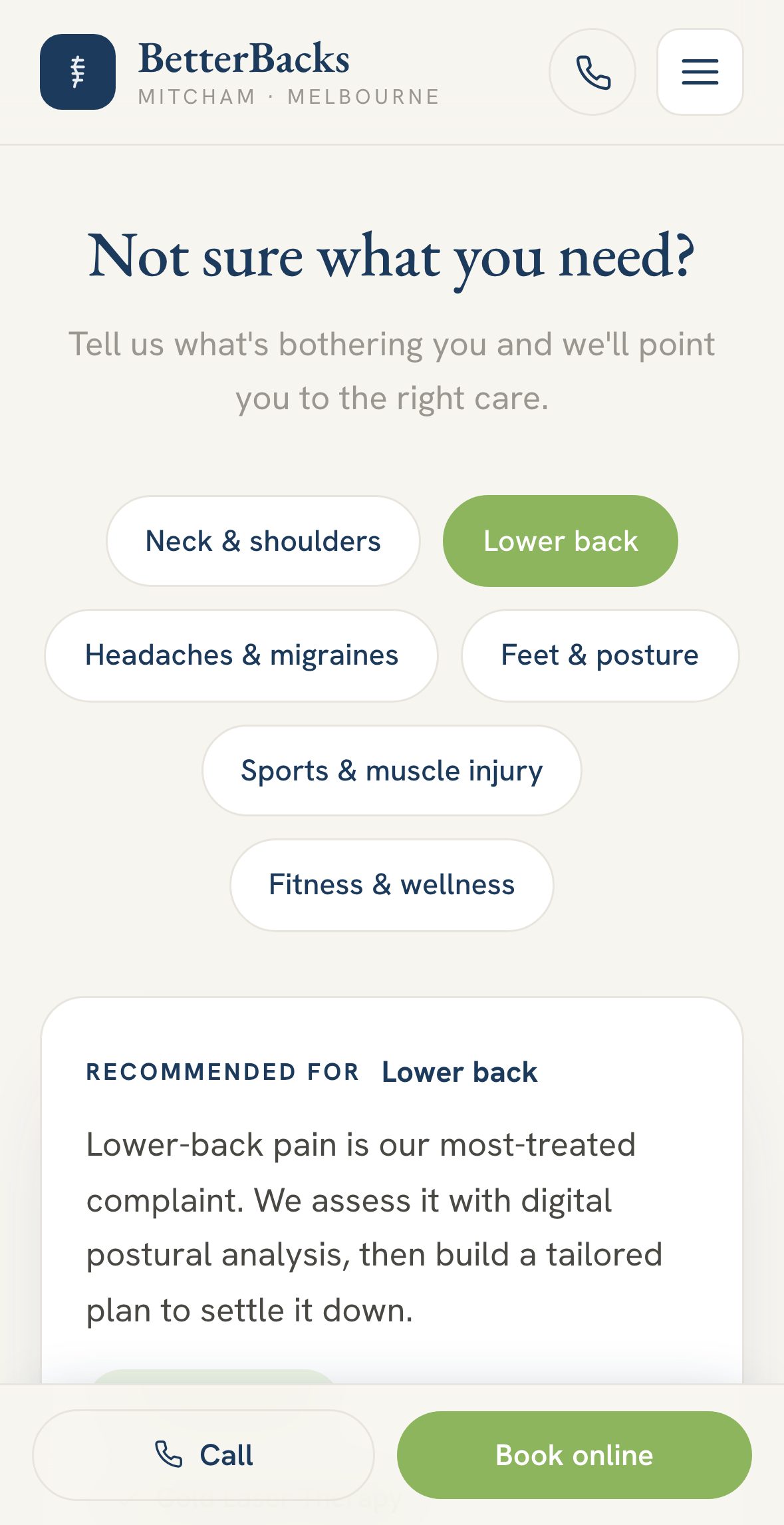
Most new patients don't know which treatment they need, but they know where it hurts, so the homepage starts there. A "Not sure what you need?" selector matches symptoms like lower back pain to the right treatment and practitioner, putting patients on the right path from the first screen.
Journeys with no dead ends
I mapped the journeys new and returning patients take to a booking. Returning patients can go straight to their treatment; new patients are guided to it. Every service page follows the same simple template, what the treatment is and what it helps with, and ends in a booking or enquiry.
A menu that shows the whole clinic at a glance
With the journeys mapped, the information architecture brought them together. A long list of treatments and conditions risked a menu that either hid content or overwhelmed people. The answer is a mega menu: one panel that shows the whole clinic, grouped the way patients look for care, without cutting any content.
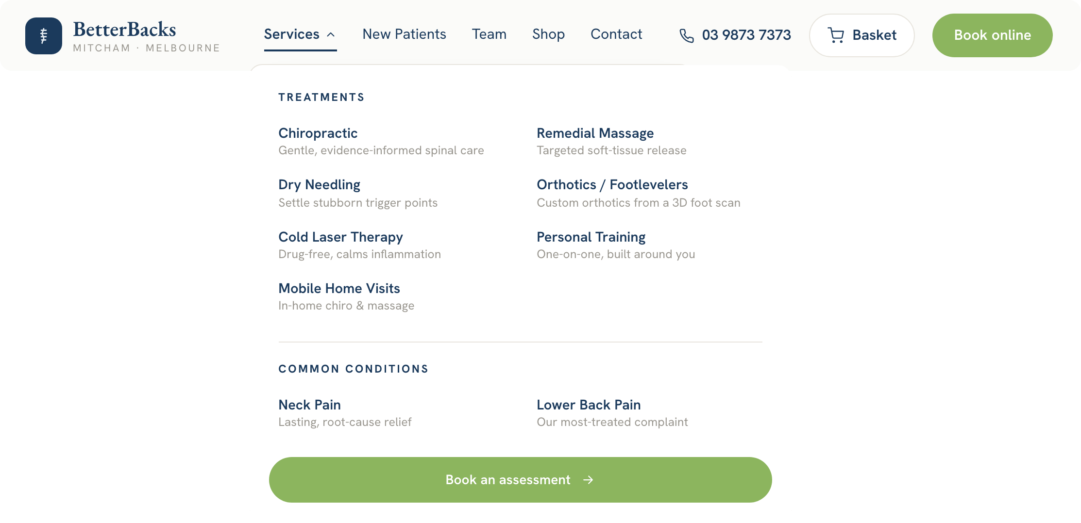
01One tap opens everything
Hovering over or tapping Services opens every treatment and condition in a single panel, so patients see all their options at once instead of clicking through page after page.
02Two ways in: treatments and conditions
Patients who know their treatment can go straight to it; those who only know their symptom can start from the condition. Both routes lead to a booking.
03Microcopy that signposts
Each treatment carries a one-line description, like "Targeted soft-tissue release". This short supporting copy, known as microcopy, lets patients tell options apart at a glance without opening each page to compare.
04A clear call to action, always
"Book online" and "Book an assessment" share the primary button style, so booking is always the most visible action. For patients who'd rather talk first, the phone number sits right beside it.
Booking, built into the site and designed for mobile
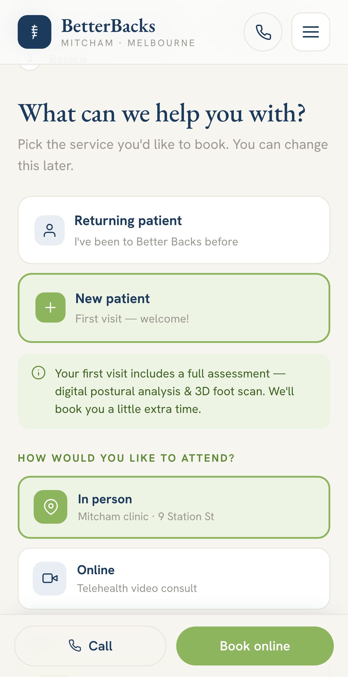
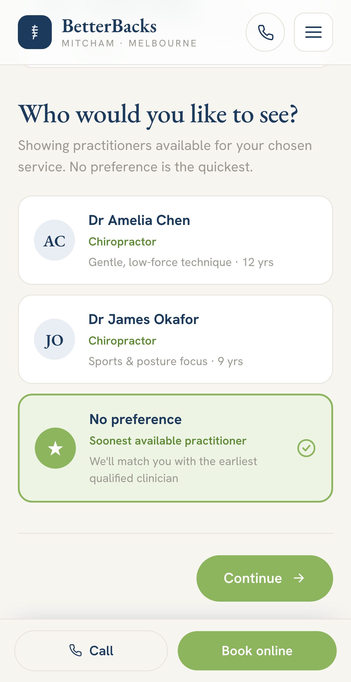
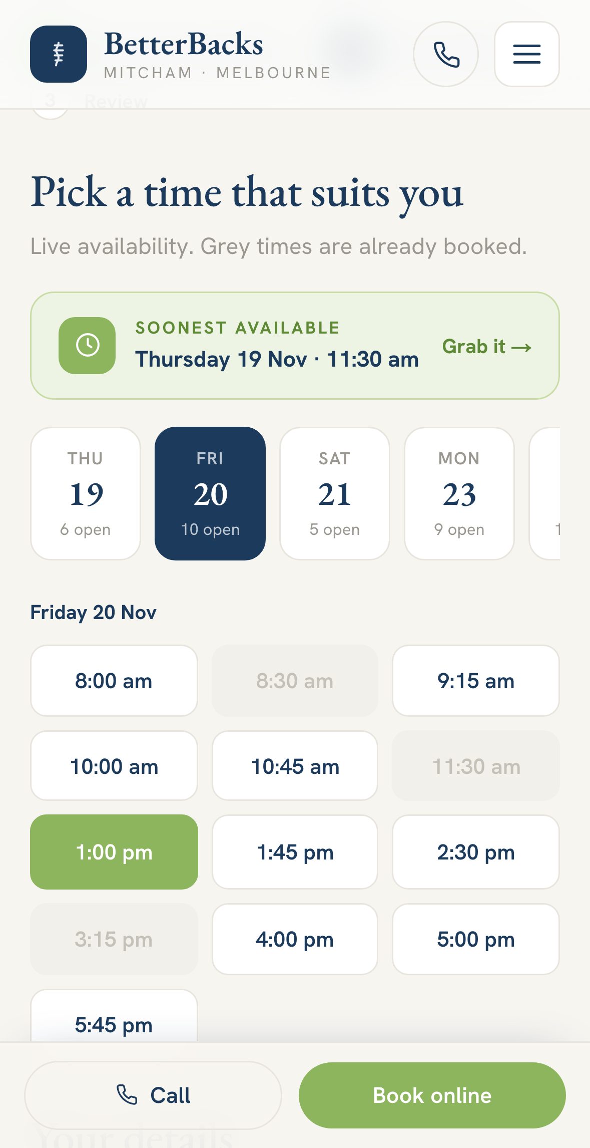
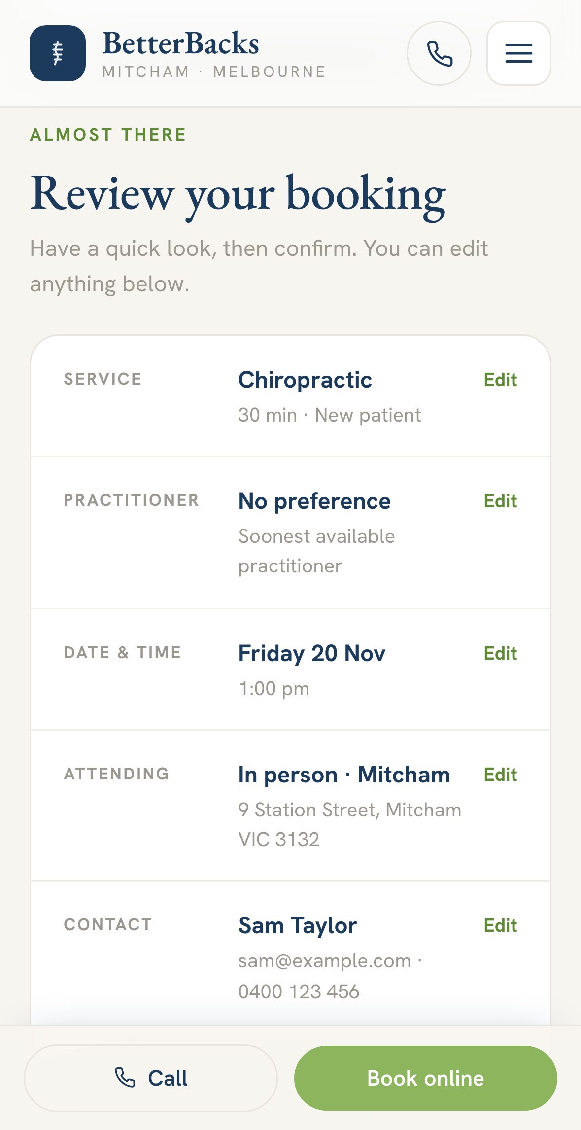
Every journey ends in a booking, so booking has to work everywhere. The current site hands patients to an external system that wasn't built for mobile, which is where bookings can slip away. In the redesign, booking is a short multi-step flow built into the site and designed mobile-first: choose a service, a practitioner, a date and time, then review and confirm. Fewer steps, no leaving the site, and nothing awkward on a small screen.
A brand evolution, not a rebrand
Years of goodwill sit behind the BetterBacks name, so rather than start again, I evolved the brand: a deep navy that brings clinical credibility, paired with the heritage green patients already recognise, with cleaner typography and a more structured layout. The Google reviews moved up the page, where they help new patients decide.
The content was rewritten to match. Long-form copy was edited down to what patients need, and turned into visuals where that's easier to take in. I wrote the marketing copy, UX writing (the labels, buttons and prompts that guide people through) and service content throughout, and created fresh imagery and icons with AI, art-directed to stay consistent with the brand. The result is a complete working website, ready to launch.
Let's talk about your website or app.
I designed, built and hosted BetterBacks myself, leading a team of AI agents the way I've led agency teams for over ten years. I set the strategy, brief each specialist, review every piece of work and make the calls. You get one person accountable for the whole thing, from product strategy and experience design to brand, development and hosting, without the overhead of a big agency.
Whether you run a clinic, a practice or a growing business, I can help you find where your website or app could do more, then design it, build it and, if you'd like, host and look after it.